Pages

Showing posts with label Illustration. Show all posts

Sunday, March 18, 2012

A Chance Encounter


A Chance Encounter, oil on canvas, 32x24.

Glad to finally get this one off the easel.  It was a good slog through the final work on the three adventurers, with lots of rethinking and repainting as I changed a few things up for the finish on this, and maybe figuring out some semblance of painting that feels right.  So I broke down and added a nit-picky round sable to my stable of hog bristle brushes, and also made copious use of a burnt sienna, ultramarine, raw umber, and pretty much any other dark on my palette glaze for the final shadows.  All in all, pretty happy with how everything turned out.  Enjoy.

Also, props to my student Matt Gray for the "Golden Axe" suggestion, though he's a bit too young to get the reference...

Wednesday, December 21, 2011

Happy Holidays


And the gift of new work.  Not much commentary for this first post in a long time, as I have a pint sized art director sorting through the desk next to me.  Two newest pieces off the easel in order:

Early Gifts, 21x30, oil on canvas.
This is the Holiday card for the high school where I teach, and continuing the trend that I started last year, I've made another family portrait out of it.  And also, continuing the trend I started with my first card four years ago...there's still a wreath in it.

RTM, 30x18, oil on canvas.
A wedding gift for the excellent Dr. and Mrs. Bongiorno, featuring an excellent Mecca for food - Reading Terminal Market.

Monday, February 14, 2011

Of Giants and progression...


A short little post with some WIP shots of my latest painting.  I've been taking the opportunity to work back through some of my thumbnail sketches from right after I got back from the IMC last year.  And this frost giant has been lurking around in my sketchbook just waiting to find a piece of unsuspecting canvas.  There's obviously a long ways to go in the painting above, but I'm really digging the blues in the underpainting so far, I'll have to see how much of that stays, and in turn, see how much it forces me to change in the figures in the foreground. 


The sketches for our three adventurers were pretty straightforward, although I'm sure our neighbors think I'm now truly crazy - I shot everything behind our garage (hey, the light was right...).  And just for kicks - the dwarf up top started out as me snarling with a snow shovel, I'll let your imagination do the work on that one, as I don't think I'll let that reference see the light of day.

 And, here's the origin of our starring giant/titan.  I had been wanting to make a maquette for a while now, and this seemed the perfect opportunity.  They are absolutely fantastic tools for finding value reference, and damn fun to build as well.  I found that my sketches never quite got to what I was looking for in the giant's face, so I figured I would kind of "feel" everything out in the clay.  It worked quite well, but I found that the maquette ended up with a bit of a "slow" feeling in the face, the tight drawing turned out to be a bit of a blend of thumbnail sketch and model.  A good learning experience in all, and I'm really looking forward to getting this one finished up.

Sunday, January 23, 2011

Firebrand


Firebrand, 28.5 x 22, oil on canvas.

Finished this one up about two weeks back, and have just been waiting to get a good photo of it.  I am now sold on the fact that the family point and shoot is no longer up to the task of shooting my paintings -I could not get the color right on this piece for the life of me.  Here's to Mother-in-laws with photography degrees and excellent equipment (Thanks Char!).  
I don't think I really intended to have the glows go quite so "fiery" but once I got the cads on my brush, I couldn't help myself.

The Guardian


 The Guardian, 30 x 24, oil on canvas.

About time this one was finished.  Believe it or not this guy has been lurking in the studio since about last April.  The water, Good Lord, the water.  How it taunted.  Quite a challenge getting all those waves in there, I think it turned out alright, but I'll definitely have to tackle another "maritime" piece for some much needed practice.  I'm sure that there's some dumb-easy trick to painting water that I just glossed over in the alla prima painter's handbook, but man - this was a challenge.  I also suppose this could be considered my first "dragon" painting.  Though I prefer to think of the beasty as an overgrown snapping turtle.  The finished drawing below for some comparison.


During the painting of all that water, I decided that the little silhouetted shaman/priest fellow on the cliff had to go.  I think it works a little better for the composition and storytelling (I like cliches as much as the next guy, but this was definitely a decision that I was more in love with 8 months ago than now), plus it was a complete pain to keep painting around him...

Oh, and I also managed to spell the file name incorrectly - yay, English.


Monday, December 6, 2010

A Delaware Christmas


A Delaware Christmas, 21x30, oil on canvas....And sketches.

This year's Christmas/Holiday Card for the high school.  I will forgo my usual hesitancies with my own artwork and come out and say that I'm really pleased with this painting.  It was some of the most fun and fulfilling work I've spent at the canvas in a while.


Sunday, October 31, 2010

War Priest Finished Pencils


Piggy-backing off of the post below...at least I made use of the time between my "free time."  I think I mentioned this before, but I find it's a lot easier to drop in and out of a drawing while teaching than to drop in and out of a painting.  Fairly happy with the skulls in the background, but still need to tweak the values.  Hoping for paint around December.

Friday, October 22, 2010

Harvey, not exactly an NDA...


The high school that I teach at has a really great drama department, and since last year I've been doing the poster art for the fall and spring shows.  This fall's show is Harvey - set in the 1950s, it's a little yarn about a fellow named Elwood who sees a spirit, Harvey, who happens to be in the form of a six foot tall rabbit.  Needless to say, Elwood's a bit off his rocker, since no one else can see Harvey, but it's his sister, Veta, who has grown tired of Elwood's eccentric behavior, that gets committed to a sanitarium.  Don't worry, there's a happy ending.

These posters are a great opportunity for me to stretch my "inking" legs, since they are printed in black and white, and try to channel some of the great illustrators that I admire from the past.  The figures are the two leads from the show, we did a quick photo session (man does stage lighting come in handy...), a few sketches for an approval from the drama teacher, some ink and hand lettering later, and here we are. The printers will take care of the rest of the layout, I'll try and post the finished poster once it gets back.  Good fun.

Wednesday, August 18, 2010

The good, the bad, the mystic...


Every gunslinger worth his salt needs a magic magenta winchester...

This also ended up looking a little more like me than I wanted...well me minus about 75 pounds...


Sunday, July 11, 2010

IMC 2010

In a word: Wow.

In many words:

Begin stream of consciousness...

I spent the week of June 12-18 up in Amherst, MA at the Illustration Masterclass, and it was without a doubt the best experience of my artistic life.

The class was created by the fantastic Rebecca Guay, and the other instructors included folks such as Boris Vallejo and Julie Bell, Donato Giancola, Dan Dos Santos, Scott Fischer, Greg Manchess, and Irene Gallo, with special guest appearances by James Gurney and Jeremy Jarvis.  The class is open to anyone who wants to enroll and a choice of assignments is given beforehand, each student is to choose one to work on during the course of the class.

I don't know if I can truly encapsulate the whole experience into any kind of coherent statement, it was a crazy week full of new people, new ideas, fresh takes on old ideas, reinforcement of skills, and everything in between.  I met a ton of great people, most of whom I will hopefully keep in contact with for a long while to come.  So here goes...

The class started with a good old fashioned critique of everyone's sketches, it was just like school we hung everything up on the wall and the faculty went through each one and gave feedback.  It was straight up with what worked, what didn't and how to fix it, and it looked kind of like this:


Needless to say, this took a while.  The class was about 85 students total, and we broke into two separate groups and I was in the upstairs group whose critique was run by Donato, Dan, Boris and Julie, and Irene.  We clocked our critique in at just over 5 hours, the downstairs group which was headed up by Greg, Scott, Jeremy, Rebecca and Jim finished in around 9 or 10 hours.  Word has it there was a lot more "fun with tracing" in the downstairs group with Scott, Rebecca, and Greg drawing all over everyone's sketches.  While the critique portion did take a while, it was incredibly informative to hear the feedback about others' work, and for me, some of the most critical ideas and concepts came from the notes I got during this session.  The critique also served to show that there was some serious skill on display at the class.  About a quarter of the students in the class are pros already.

So I didn't take a shot of my initial sketch (the assignment I chose was Joan of Arc), but after the crit and some time at the drawing board, it looked like this:

The drawing had started with two additional figures, kind of like a personal guard, with big old two handed swords.  The very first comment I got from the instructors was to lose the extra figures, which is funny since my first thumbnail for the piece was Joan floating like this with her banner, and I then proceeded to spend a dozen or so pages trying to figure out how to "fill up" the rest of the composition.  Big mistake, the figures were just filler and it showed, one of many things learned - if it's not essential to the piece, it shouldn't be in the piece.  So Joan is the focal point, make the painting about Joan.  So with this in mind I moved on into the painting and over the next four days (and nights) or so ended up with this:

I got some good feedback on this along the way, but overall I wasn't really that happy with it.  I realized that in general, I had come into the class very under prepared, and that was perhaps the best thing that could have happened.  Well, maybe not the best, but it forced me to really look at how I was approaching my art, about how I should never take anything for granted and always make sure what I'm doing is as good as I can possibly make it.  

As the week went on, a lot of us started talking about what our big "take away" was from the class.  For some, it was this or that bit of technical information or way of handling paint, and at the time I said that my big "take away" was that I was going to go home and do the painting over but twice as big.  One of Greg Manchess's first comments to me was that the painting was a bit small (16x24).  So that led to me getting back home and rethinking my reference and redrawing my sketch (at 16x24) and ending up with this:


and this:


The original is that puny little thing at the bottom...

Greg mentioned that he often keys the size of his paintings the main figure's face, just to make sure he has enough room to really work out all of the essential details.  I had really started to work bigger before I left for the class, but I wasn't sure how much room I would have at Amherst, so I opted to bring the 16x24 board and just hack it out, mistake number two.  So this is where I'm at right now, I don't think this is the biggest painting I've ever done, but it's the biggest in a while.

Back to that "take away" from the class.  Mine really wasn't doing a big painting, the real take away that I got from the IMC was community.  I love fantasy and sci-fi art, it's what got me interested in art in the first place from the very first comic books that I cracked open, to the first time I saw a Boris Vallejo painting in the bookstore and made sure that my parents didn't see me looking at it, or the first time I discovered that Frazetta was FRAZETTA, to the first copy of Spectrum that I picked up and saw Greg and Dan and Scott and Donato's work and thought, "man, where have I been to have not been looking at this stuff all along."

Maybe it was college, and to some extent growing up, and feeling like fantasy and scifi and all the fun stuff was just supposed to be for kids (or nerds, dorks, or whatever, your pejoratives will not phase me). And especially having that reinforced by art instructors who didn't even feel that I should be working with representation.  But that's neither here nor there.  IMC opened my eyes to a whole community of like-minded people, hell, it opened the door to that community, and the great thing was that everyone was basically standing there saying, "come on in."  That was another thing that blew me away, here are all these people who didn't exist beyond the printed page for me a month ago, and now I've met them, I've talked with them, they've critiqued my work, we've joked around, we've partied together...They're real folks, and they're really good folks.  As I mentioned earlier, I hope to stay in contact with as many of the people that I met at the IMC for as I can for as long as I can.  

Starting to ramble and gush here, better wrap it up before it gets ugly... 

The IMC let me walk into the world that I love and always wanted to be a part of as far as my art is concerned, and it showed me that everyone working in that world is a real person who is doing just that - working, and the only requirement for being a part of the world comes back to something I tell my students all the time (which may be corny but hey I am a high school teacher after all):

"It's like Nike Art - just do it."


Friday, May 7, 2010

'bout Time.


About time I get this off the easel.

Wednesday, March 31, 2010

Bard. Me. Me Bard...

A little progress post.

Another piece from The Hobbit, as well as the "How do I work?" category.  I feel like I'm getting closer to figuring things out.  The beasty from the last post definitely got me thinking in more step-by-step terms, a set process to work through, if you will.  But I'm still not totally sold on a few issues.  I may just be hard-headed at this point...

This is Bard, and as I'm not sure if my Mom has finished reading the book yet, I'll leave it at that.


A little sharpie thumbnail, was digging this.  Lots of energy.


Learning from mistakes.  This is a terrible drawing, I debated not posting it.  I may yet remove it.  But it serves a purpose for the moment - this is out of my head, going off of the sketch above, and it is useless.  It solves no compositional problems, it's stiff, inaccurate, and just plain bad.  Now I think I may leave it up, just to shame myself into never drawing like this again...


My faithful assistant, getting ready to give some critique...


"Something looks a little off..."


"There.  I fixed it."

I had a lot of reference for this one, so I'm not gonna post all of them, but in summary:  I did pose using a stick and a curtain rod for the bow and arrow, and I definitely took a picture of one of our stew pots to get ideas on reflected metal... So here is the drawing thus far:


Well, that's not quite how the drawing stands, I finished most of it up (I think) before I sat down to post this.  Originally, I wasn't going to make this a self-portrait, but then I figured I might as well go for it, as I haven't done one in a while, Bard is a pretty cool character, and I didn't feel like looking up another face to plop on my figure.  I also haven't worked this realistically in a while, we'll see where this goes.  I'm not sure if I want to continue working with this much realism, but I have a feeling it may be good for me to really crank out some polished pieces.  Plan from here is to get a copy made of this drawing (it's 20x30, I just wanted to do something big) then mount the copy to masonite, seal it in, and then paint.  I'll make another brief post when I've got the painting surface ready.

One last note, I should have done a quick reread before I started drawing.  It's a thrush that comes to Bard, not a raven.  Ah well, at least I'll have a self-portrait out of it.  And another thing that this particular piece is teaching me, is that there is ALWAYS so much more to learn.  And after chewing on that a bit, I find it incredibly refreshing.


Saturday, March 27, 2010

Informed Drawing

When I was in college, (I've been starting a lot of sentences with that qualifier as of late...) I had this stupid notion that using references was "not allowed."  Actually, it was a very stupid notion, but don't think for a minute I'm talking down about those supremely gifted folks who can pull just about any kind of imagery out of their head, God bless 'em.  I just don't happen to be one of them, I need help getting those images completely out of my head and onto the page.  So, for me, the notion of constraining myself to not using reference images was a stupid one, really.

So recently, after reading and listening to a lot of other artists who are working, and making fantastic work, I realized that a great many of them use extensive references while they are working.  Now this doesn't mean they're nothing but "copy monkeys," dear God no (and you would never even think that if you saw their work), it means they're smart and know how to make creating the image easier, more desirable, and more effective for them.

So, stepping down from the soapbox, I've been recently trying to incorporate more reference into my work, and I've been enjoying the results.  So onto the pictures:

Brief was straightforward:  Giant amphibious creature (my initial thought was frog, but then my inner 4th grader, which knew what was an amphibian and what was not, was silenced by my outer 26 year old which thought that turtles would be way cooler...even though they're not amphibians...)

So the sketches came quickly:


Now, the top three going clockwise, are about as close as I'm gonna get to pulling a frog/salamander creature out of thin air.  So I could spend another couple of hours trying to layer on details without having decent construction lines underneath, but that would be beside the whole point.  But I did know that the bottom couple of sketches would give me my composition - large creature rising out of the water to the left with a person or people on a cliff to the right (maybe they're cheering it on, maybe it's gonna eat them...I'm going with the former).

So now it's time to go get some pictures.  Do it to it Google:

Again, I was initially going with frogs, so the bulls seemed like a good idea (maybe I'll use that texture on their skin..).  I was also toying with the idea of boats getting tossed around as the creature rose out of the water (so that's where the junks fit in) and maybe some kind of village on the cliff instead of the people (hence the shanty town).  Now, I really started to drift away from the frogs when I stumbled across pics of the alligator snapping turtles - those guys are AWESOME, pure dinosaur.  As for page 2, subs and whales for clues to what water does when something big leaves it with a lot of speed and force, and the cliff just has a fantastic shape.  

So I've got my ref, time to put together a working rough drawing:


Was feeling pretty good about this for about 45 minutes worth of work.  Stuck pretty close to the comp in my thumbnail - creature left, people on cliff right.  Was totally digging the snapper's shell, so I pulled on a lot of that for the over all design of the creature, along with mishmashing it a bit with some humanoid anatomy as well as pretty much every dragon/monster/thing I've seen since I was a wee lad.  The grid is a handy little tool for making sure that the shapes and lines from this little rough carry over into my preliminary drawing (since this guy is about 4 in x 5 in).

So, with that, several hours of pencil twirling later:
Graphite


Photoshop Trickery

I'll admit, I'm happy with this one.  It was good fun to really work through a project in this manner, as I feel I have always been a bit lax with my "process."  The initial plan was to then use this drawing which is 8x10 as my reference for a painting, which I will probably do sometime in the near future.  Several years ago, I would have probably asked, "What's the point of all this work?  Just jump into the painting already."  Several years ago...ahem...when I was in college...ahem...I didn't really know how I needed to work, or maybe I just knew how I thought I should work at the time.  But now, I really feel like the extra steps help me in getting the image out of my head and onto the page, this was really made clear to me by the vulture piece I just finished.  And I'm going to try and continue to work this way for a while, who knows maybe in 5 more years I won't need all these steps, and then in 20 years I won't need the reference...yeah, right.  Well, we'll see anyway.

Last question, if you're still reading, which of the two finals do you like?  Answer down in the comments if you're so inclined.  So, thanks and 'til next time...


Sunday, March 21, 2010

Carry On Carrion


Finished Piece for the Art Order Challenge, Mutation Nation.

This was good fun, yet another visit to the category of "how do I like to approach painting?"  A little bit of Manchess towards the end of this one provided some much needed incentive, and a nice reminder to stop thinking so much and just paint.

Wednesday, March 10, 2010

Art Procedural

So I got distracted this week with a challenge from the great blog ArtOrder.  Going off of the prompt and Mr. Schindehette's description, it seems like pure cheese...my favorite kind.

Plus I got off of my butt and did some process shots as well, so here goes part II of that challenge - Anthropomorphized critter (probably will be read as a vulture by most, but he's a turkey buzzard at heart):
The initial scribble.
The next scribble.  I liked the first one more.

Some thumbs to get my comp in order, I was feeling more of a portrait look for our carrion friend.
Working sketch.  Lots of Mad Max in this, as well as a bit of glare off the graphite.

Painting in progress with a few little tweaks from the sketch.

Things gleaned thus far:
         1.  It pays to hunt for reference material.
         2.  It pays to develop that working sketch as much as possible.

Funny how I tell these things to my students all the time and then think I can skip them...

Oh and here's that spider, I didn't forget completely:


Thursday, March 4, 2010

'bout Time


Remember this?

It finally turned into this:


This has been on my work table way too long, but here goes:

The Good:  Smoke rings and Thorin et al ( i.e. the dwarves)

The Bad:  Bilbo, totally dropped the ball on him and he's RIGHT IN THE MIDDLE OF THE COMP!

Things to take away:  More work in the drawing and sketching stages; start things and finish them - this sat for too long between too many sessions of paint, ergo, no flow.

"Queer Lodgings," 16 x 20, oils on Illustration Board.

P.S.  on the time issue and things sitting for too long...there will be a finished drawing for the next Hobbit painting posted by Sunday night.  

P.P.S.  there will be spiders.


Monday, February 22, 2010

Hiatus broken with Sound of Music, Part I


Oh jeez.  Long time no post.

I have been working on things, I swear.  Just many other things going on as well.

This is the poster art for CRHS's Spring (actually still Winter) musical.  Part II will be what it looks like with all the text, as that's out of my hands.  Lots of geeky symbolism, as the first thing that John, the Drama teacher, told me he didn't want was Julie Andrews in front of mountains.  If anyone follows this, I'd be interested to see if you pick up on any of said symbolism.  Feel free to leave interpretations in the comments.

Pen and Ink on bristol, 11 x 17.

Next up will be either Peter Pan (with Process!) or The Hobbit.

Tuesday, January 26, 2010

Grendel


Three and a half years ago, I got the high minded idea to illustrate Beowulf.

I was a slacker then and it never happened, but I did read Seamus Heaney's fantastic translation, and now I'm warming back up to the idea.  This is a bit more of a test than anything else, mainly to see how the pen and ink works.  I'll be drifting heavily into the Hobbit work over the next month or so, but coming back to these in the spring.

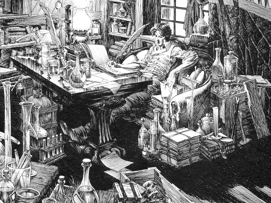
"Grendel's Fen."  Pen and ink and lots of little lines.  This could perhaps also be titled, "How to put way too much detail in your drawing."  Around 8 to 10 hours, lots of big time inspiration from Bernie Wrightson's Frankenstein, and hopefully worth the scroll on the big version.