
Three and a half years ago, I got the high minded idea to illustrate Beowulf.
I was a slacker then and it never happened, but I did read Seamus Heaney's fantastic translation, and now I'm warming back up to the idea. This is a bit more of a test than anything else, mainly to see how the pen and ink works. I'll be drifting heavily into the Hobbit work over the next month or so, but coming back to these in the spring.
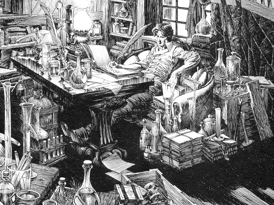
"Grendel's Fen." Pen and ink and lots of little lines. This could perhaps also be titled, "How to put way too much detail in your drawing." Around 8 to 10 hours, lots of big time inspiration from Bernie Wrightson's Frankenstein, and hopefully worth the scroll on the big version.

Nice, man. Now this is something I quite like but could never do competently. Reminds me a lot of the old 2nd ed. Dungeons & Dragons illustrations that have, one way or another, had a profound affect on my aesthetics. On a side note, this makes me wonder how you'd handle landscapes/spot illustrations in a similar style.
ReplyDeletePlease excuse me, my nerd is showing.
Thanks dude.
ReplyDeleteOh man, that 2nd Edition stuff was awesome. I remember paging through the Monster Manual in 5th grade and just drooling over that stuff. I love that on aesthetic to man, it seems like we all have "roots" that we keep going back to. I kinda wish that someone at school would have just told us those roots were OK and not "kitch trash."
The lines end up being a lot more abstract design than one might think. And on the landscape thing:
I think my favorite part of the picture is the top third, particularly the left corner.